A: The feature area is that image-oriented section of your page “above the fold”—it’s the main attention grabbing image(s), along with any superimposed text, that users will first see when they come to your page.
If you're looking to edit the feature area on mobile, check out this support guide: How to adjust my feature area image and text to suit a mobile screen?
Adding content to the feature area is just as intuitive and easy as doing so to the rest of your Rocketspark website. There are, however, a few differences. Watch the video below for an introductory overview or read on to find out how to add content to the feature area.
Opening the editing pane
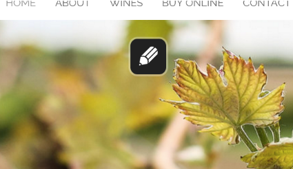
To start adding/editing content, click the pencil icon you see on the template image. This will bring up an EDITING FEATURE AREA pane on the left side of your window. This editing pane is where you’ll add/edit the content.
 Now we’ll walk you through each section in the editing pane
Heading
The heading is the main text you want people to see in your feature area. It could be your slogan or key message, and is usually a single phrase or sentence. Simply type that text into the field provided. The text you type in will be instantly visible in your feature area so that you can get an immediate idea of how it will look (first, delete the template text).
On the right side of the field, you’ll see an H1. This is a header tag, which is simply a way to assign the text a certain degree of importance in terms of search engine optimisation (learn more about header tags here). Clicking on H1 will bring up a menu of options. Use H1 for the most important heading, H2 if a moderately important heading, and H3 if relatively unimportant heading(s). You can assign the text no header tag, simply by clicking the - option.
Just above the Heading field, you’ll see a STYLE menu. Clicking on it will bring up a menu of options: Font, Size, and View all options. Clicking on any of these will bring up the Feature area design settings pane, which allows you to alter the font type, font size etc. See below for detailed instructions for altering these settings.
Blurb
The blurb is usually a sentence or two that supplements the message of your heading. Just type in this additional text into the field provided (again, delete the template text first).
There are a number of formatting options immediately above the field: bold (B), italics (I), and underline (U). Clicking any one of these will add that particular formatting type to any selected or subsequently-typed text. E.g., if you want to emphasise a particular word, you might like to select that word (using your cursor) and click Bold to make it really stand out.
Buttons
Buttons are graphical elements that link to another webpage. E.g., you might have a button that reads “Meet the team” that, when clicked, links to your “About” page, or your “Start shopping” button might take the user immediately to your online shop.
The first field is where you type in whatever text you wish to appear on your button. This could be a question (“Why choose us?”) or a call-to-action/imperative (“Get in touch with us”). For further reading see our blog on why calls to action are important.
Immediately below that field you’ll see a paperclip icon. This is how you choose where the button will link to. Clicking this paperclip with make a Select link for button box appear. Your button can link to a page within your website (select from menu), a different website to this current site (type in the URL/web address), a product category from your online shop, or a specific product from your shop (these latter two require that you select from menu—but these menu options, categories and products, must be set up in your shop before they’ll be visible here). Just click Save to save your link.
Clicking the ADD BUTTON option (above the button field) allows you to add additional buttons.
Clicking the rubbish bin icon will delete your button altogether (but it’ll ask you for confirmation before deleting).
Adjust the width, vertical position and horizontal alignment of feature area content
With your feature area editor pane open, you can adjust the vertical position of your feature area content by clicking and dragging the arrow up and down. This change is applied on a page by page basis.
You can adjust the width of your feature area content by clicking and dragging the left arrow horizontally. This sets the wrapping point of your feature area text for all screen sizes except mobile (which is determined by the width of your mobile screen size). If you have different text on each slide, you will need to adjust the width of your slide content on a slide-by-slide basis. You can change the horizontal alignment of your feature area content by clicking the left, centre and right align icons in the in situ controls. Or to change the fonts, colours, size of your feature area content, click the colour wheel icon.
Slide (1, 2 etc.)
This refers to the image(s) in your feature area. You can create a slideshow of images or just have a single image. You can also choose to have the same text on all slides or different text on each slide.
To insert your own image (recommended), click the Replace option. A file browser will appear. Locate and select the image you want to insert (the image must first be on your computer), then click Open. It may take a few moments to upload, but your image will soon appear. Once uploaded, a Reposition slide box will appear (you can also access this box directly from the editing pane by clicking Reposition). Since most images’ dimensions will be different to the feature area, most images will necessarily have parts of the image not visible in the feature area. Clicking on the image and holding “grabs” it, then moving the cursor up/down will move the photo, thereby altering what part of the image is visible in the feature area.
If you wish to use this image as the default image for your website, ensure that the Use as the default image for the site tickbox is ticked (and left unticked if you do not want to use it as your site’s default image). To save your changes, click Save changes. To abandon these changes, click Cancel.
To add more slides, click the ADD SLIDE option and repeat the above process. Once you add additional slides, the images in your feature area will become a slideshow, i.e., the feature area will scroll through whatever images you put in there. To keep the same text throughout the slideshow, leave the Use same text for all slides toggle to “on” (green). To use different text for each slide, click the toggle to “off” (red). A confirmation Activate per-slide content? Box will pop up—click Yes (note: this will delete any text you may have already written). Click the pencil icon above each slide to customise the text for that slide, the same way as outlined above (“Heading”, “Blurb”, “Buttons”).
If you have multiple slides, you can alter their order simply by clicking (and holding) the arrows icon above the slide and moving the slide to your preferred position.
If you wish to delete this slide, click the adjacent rubbish bin icon. A confirmation box will appear—click Yes (or Cancel if you do not wish to delete it).
How can I delete a slide in my feature area?
To delete a slide from your feature area you will need to be logged into your dashboard. When you are in the editor section of your dashboard you will see a pencil hovering over your feature area. Click on this pencil icon.
 After you have clicked the pencil icon, a menu will appear on the left hand side of your screen. Here, you will be able to see all of the slides in your feature area.
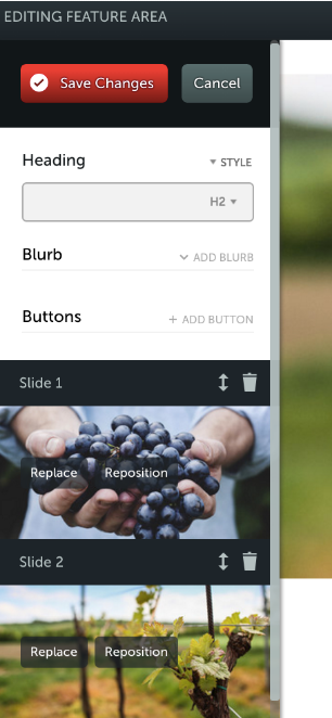 You will need to choose the slide you want to remove and click on the bin icon above that slide.
  Doing this removes the entire slide from your feature area. It will give you a warning before it is deleted to ensure this is what you want to do.
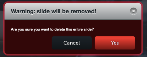 In this menu you can also reposition the pictures in your feature area, replace them with a new picture, or change the order in which the pictures are shown.
Feature area design settings
You can further customise a lot of elements in the feature area, so that you can get the right font, menu position, button look, text wrapping point, background colour, text shadow, vertical position etc. To access these options, click Feature area design settings. A new pane will appear with the following sections (simply click on the relevant section to access it—the section will expand to show you its options):
- Feature Area Height
This controls the height of the feature area image. Click on the slider and drag it to the desired position. Moving it to the right will increase its height; to the left will decrease it. Clicking the Full height feature area toggle to “on” (green) will ensure that your image will automatically resize to a user’s window, regardless of the size of their screen.
- Menu position
This alters the position in which the navigation menu appears. Select from the menu either Menu is above the feature area or Menu is below the feature area and the menu will be positioned accordingly.
- Transitions
This allows you to choose the type of transition effect you want between slides. Select from the menu No transition effect to have images transition without any effect; Fade between slides(default) to have images transition using a quick dissolve; Horizontal scroll between slides to have images transition with a wipe; Tile between slides to have images transition using a tiling effect. - Text Styling
This is where you can customise the font type, size, colour, text shadow or text background colour. Select the desired font, size and colour from their respective menus (the menus for the heading and blurb are the same). The text changes will be instantly visible, allowing you to easily try various options. To add a text shadow, tick the text shadow checkbox and adjust the colour, placement and size of the shadow. When you add a text background with the text background drop down selector, you can adjust the roundness of the corners, background opacity (see-throughness) and background colour.
- Colour Overlay & Opacity
This enables to you to alter the image’s appearance using an (opaque) colour overlay. Click Colour to choose from the colour palette the colour you wish to use as an overlay (we recommend choosing a colour that matches or complements your website’s overall colour scheme). To adjust the opacity (i.e., its “see-throughness”), click on the slider and drag it to the desired position. Moving it to the right will decrease its transparency; to the left will increase it. Colour overlay and opacity allows you to cleverly adjust your images so that they fit nicely into your site’s colour scheme.
- Button Styling
This is where you can customise the look of your buttons. Select the desired font, size, text colour, and button colour from their respective menus. To adjust the opacity of the button, click on the slider and drag it to the desired position. Moving it to the right will decrease its transparency; to the left will increase it. To change the button corner-style, select from the menu either Rounded corners or Square corners.
You’ll also find a short menu at the bottom of each expanded section. From this menu, select either Changes apply to all of your pages or Changes apply only to this page, depending on whether or not you want these changes to apply only to this particular page’s feature area or to the feature area on every page on your website.
To return to the main editing pane, click the red back arrow at the top of the design settings pane.
Saving your changes
If you’re happy with what you’ve done, click the big red Save Changes button at the top of the design settings pane. Of course, nothing is set in stone. One of the great things about our system is that you can easily go back and change things later on.
If you do not want to save your changes, simply click Cancel and your page will return to how it looked before you began editing.
Video Feature Area
If you are wanting to have a video background in your feature area that loops to display business or products, you can delete the whole feature area section and replace it with a normal stack and add a Video Stack Background.
One thing to note is with Video Stack Background, your menu and logo won't overlay the video background but can only float above the stack.
If you want the overlay effect, contact our Customer Success team to get a quote and a vote for it as a feature request—we can embed this for you by creating some custom code and also share the recommended requirements for a Video Feature Area so you can get the most out of the area.
Was this article helpful?
That’s Great!
Thank you for your feedback
Sorry! We couldn't be helpful
Thank you for your feedback
Feedback sent
We appreciate your effort and will try to fix the article